
Cradle Tab Bar Animation in NativeScript
In this tutorial, you'll learn how to create a bottom navigation bar with a cradle like effect that can be either dragged or clicked. The…
Take control of your career. Build JavaScript mobile apps.
In this tutorial, you'll learn how to create a bottom navigation bar with a cradle like effect that can be either dragged or clicked.
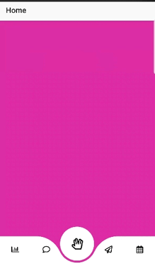
The final result will look something like this..
Getting Started
To start with, we begin with a parent GridLayout with rows * and auto in our home.component.html to divide the screen into 2 parts - the main content area and the tab area.
<!-- home.component.html -->
<GridLayout rows="*, auto">
    <ScrollView row="0" rowSpan="2" paddingBottom="100">
      <StackLayout>
        <!-- main content -->
      </StackLayout>
    </ScrollView>

    <GridLayout row="1" height="100">
      <!-- bottom tabs -->
    </GridLayout>

</GridLayout>
Note the main content area has a rowSpan of 2 which means it spans all the way to the bottom of the screen, tucked behind the bottom tabs. Also, the ScrollView has a paddingBottom set to the height of the GridLayout that will contain the bottom tabs, this is to allow to scroll to the end of the content.
Tab Bar Layout
The tab bar layout consists of 3 parts positioned as shown in the code below:
- base layer
- left tab container
- right tab container
- center tab container
- center circle
- tab contents
- draggable circle
To give us more control and flexibility with the tab contents and properties, We will set the tab contents and properties through our typescript file and loop through and use them to display them in our template instead of declaring them directly in our template.
// home.component.ts
// Tab Contents and Properties
tabContainer = {
  backgroundColor: '#fff',
  focusColor: '#fff'
};
tabList: { text: string, icon?: string, color?: string, backgroundColor: string, fadeColor?: string }[] = [
  { text: 'A', backgroundColor: '#5B37B7', color: '#000' },
  { text: 'B', backgroundColor: '#E6A938', color: '#000' },
  { text: 'C', backgroundColor: '#C9449D', color: '#000' },
  { text: 'D', backgroundColor: '#4195AA', color: '#000' },
  { text: 'E', backgroundColor: '#4195AA', color: '#000' }
];
<!-- home.component.html -->
<GridLayout row="1" height="auto" columns="*, *, *, *, *">
<!-- base layer -->
<AbsoluteLayout col="0" colSpan="5" verticalAlignment="bottom">
<GridLayout #tabBGContainer columns="auto, 10, auto, 10, auto">
<GridLayout #leftTabs col="0" colSpan="2" height="80"
[backgroundColor]="tabContainer.backgroundColor"
verticalAlignment="bottom" borderRadius="0 68 0 0">
</GridLayout>
<GridLayout #centerPatch col="1" colSpan="3" height="40"
[backgroundColor]="tabContainer.backgroundColor"
verticalAlignment="bottom">
</GridLayout>
<GridLayout #rightTabs col="3" colSpan="4" height="80"
[backgroundColor]="tabContainer.backgroundColor"
verticalAlignment="bottom" borderRadius="68 0 0 0">
</GridLayout>
<!-- focus circle -->
<GridLayout #centerCircle col="1" colSpan="3" height="100"
width="100" [backgroundColor]="tabList[currentTabIndex].backgroundColor"
borderRadius="50" verticalAlignment="bottom" marginBottom="10">
<GridLayout verticalAlignment="center" horizontalAlignment="center"
height="90" width="90" [backgroundColor]="tabContainer.focusColor" borderRadius="45" </GridLayout>
</GridLayout>
</GridLayout>
</AbsoluteLayout>
<!-- tab contents -->
<GridLayout #tabContents *ngFor="let item of tabList; let i = index"
[col]="i" marginTop="20" (tap)="onBottomNavTap(i)" verticalAlignment="middle">
<Label [text]="item.text" verticalAlignment="middle" horizontalAlignment="center"
[color]="item.color" fontSize="20">
</Label>
</GridLayout>
<!-- pan layer -->
<GridLayout #dragCircle column="0" colSpan="5" (pan)="onCenterCirclePan($event)"
verticalAlignment="center" horizontalAlignment="center" height="90" width="90"
backgroundColor="transparent" borderRadius="45">
</GridLayout>
</GridLayout>In terms of z-index, the base layer consisting of the left, right, center tab container and the center circle is placed at the very bottom, followed by the tab contents second, and draggable circle at the very top.
The reason for this positioning is the base layer has no tappable elements, acting as the background that gets animated, hence being placed at the very bottom.
The tab contents contains elements that can be tapped by the user that will trigger the animation
The draggable circle only covers the width and height of the center circle at the base layer, this is a transparent layer placed at the top in order to allow the user to drag the circle along the tabs to select one of the tabs.
To get the cradle effect, a top right border radius is set on the left tab container and a top left border radius is set on the right tab container. This creates a smooth corner at the top. To connect this curve with the center circle, we add a center tab container, which is a rectangle half the height of the left and right tab container vertically aligned to the bottom. and another circle inside the center circle which will act as the actual focus circle, with the outer circle cutting away parts of the center tab container. This creates a smooth line that connects both the left and right tab containers.
Animating the UI elements
Getting references to the UI elements
We will be using @ViewChild and @ViewChildren to get references to our UI elements. We will first need to import the following properties from @angular/core
// home.component.ts
import { ViewChild, ElementRef, ViewChildren, QueryList } from "@angular/core";
Followed by the following to get reference the our tab bar components.
// home.component.ts
@ViewChild('centerCircle', { static: true }) centerCircle: ElementRef;
@ViewChild('dragCircle', { static: true }) dragCircle: ElementRef;
@ViewChild('leftTabs', { static: true }) leftTabs: ElementRef;
@ViewChild('rightTabs', { static: true }) rightTabs: ElementRef;
@ViewChild('centerPatch', { static: true }) centerPatch: ElementRef;
@ViewChild('tabBGContainer', { static: true }) tabBGContainer: ElementRef;

@ViewChildren('tabContents', { read: ElementRef }) tabContents: QueryList<ElementRef>;
Initializing the Tabs
We will use ngAfterViewInit hook to initialize our tab bar elements, setting the initial state and the default selected tab.
We will need a couple more imports to set some of the properties of the tabs
// home.component.ts
import { AfterViewInit } from '@angular/core';
import { screen } from 'platform';
// home.component.ts
export class HomeComponent implements AfterViewInit {
// track current selected tab
currentTabIndex: number = 0;
// set default selected tab
defaultSelected: number = 2;
ngAfterViewInit(): void {
this.initializeTabBar();
}
initializeTabBar(): void {
// set up base layer
this.leftTabs.nativeElement.width = screen.mainScreen.widthDIPs;
this.rightTabs.nativeElement.width = screen.mainScreen.widthDIPs;
this.centerPatch.nativeElement.width = 100;
this.tabBGContainer.nativeElement.translateX = - (screen.mainScreen.widthDIPs / 2) - (80 / 2);
// set default selected tab
const tabContentsArr = this.tabContents.toArray();
tabContentsArr[this.defaultSelected].nativeElement.scaleX = 1.5;
tabContentsArr[this.defaultSelected].nativeElement.scaleY = 1.5;
tabContentsArr[this.defaultSelected].nativeElement.translateY = - 15;
this.currentTabIndex = this.defaultSelected;
}
}In the initializeTabBar() function above, we set the leftTabs and rightTabs widths as the width of the screen in order to accommodate animating to the first and last tab (which are at opposite ends of the screen). The tabBGContainer which contains the leftTabs, centerPatch, and rightTabs, is then translated left to position the centerCircle on the default selected tab.
Set up Animation Helpers
Let's set up a couple of animation helpers to handle animating the tab contents (scale and translate) and sliding the background to display the tab's focus and unfocus state.
// home.component.ts
import { AnimationCurve } from "ui/enums";

// animation curve to be used for the slide animation
animationCurve = AnimationCurve.cubicBezier(.38,.47,0,1);

getSlideAnimation(index: number, duration: number) {
  return {
    translate: { x: this.getTabTranslateX(index), y: 0 },
    curve: this.animationCurve,
    duration: duration
  };
}

getFocusAnimation(index: number, duration: number) {
  return {
    scale: { x: 1.5, y: 1.5 },
    translate: { x: 0, y: -15 },
    duration: duration
  };
}

getUnfocusAnimation(index: number, duration: number) {
  return {
    scale: { x: 1, y: 1 },
    translate: { x: 0, y: 0 },
    duration: duration
  };
}

getTabTranslateX(index: number): number {
  return index * screen.mainScreen.widthDIPs / this.tabList.length - (screen.mainScreen.widthDIPs / 2) + (80 / 2)
}
Tap Event
On tapping one of the tabs (except the current focused one), it will move the focus to the new tab, setting the scaling and translating tab content and translating the base layer to set the center circle on the focused tab.
// home.component.ts
// Tap on a one of the tabs
onBottomNavTap(index: number, duration: number = 300): void {
  if (this.currentTabIndex !== index) {
    const tabContentsArr = this.tabContents.toArray();

    // set unfocus to previous index
    tabContentsArr[this.currentTabIndex].nativeElement.animate(this.getUnfocusAnimation(this.currentTabIndex, duration));

    // set focus to current index
    tabContentsArr[index].nativeElement.animate(this.getFocusAnimation(index, duration));
  }

  this.centerCircle.nativeElement.animate(this.getSlideAnimation(index, duration));
  this.leftTabs.nativeElement.animate(this.getSlideAnimation(index, duration));
  this.rightTabs.nativeElement.animate(this.getSlideAnimation(index, duration));
  this.centerPatch.nativeElement.animate(this.getSlideAnimation(index, duration));
  this.dragCircle.nativeElement.animate(this.getSlideAnimation(index, duration));

  // set current index to new index
  this.currentTabIndex = index;
}
Pan Event
On dragging (panning) the draggableCircle, the base layer will mirror the panning event of the draggableCircle translating and snapping to the closest tab.
// home.component.ts
import { GridLayout } from "ui/layouts/grid-layout";
import { PanGestureEventData, GestureStateTypes, GestureEventData } from "ui/gestures";

// to track the previous pan delta
prevDeltaX: number = 0;

// Drag the focus circle to one of the tabs
onCenterCirclePan(args: PanGestureEventData): void {
  let grdLayout: GridLayout = <GridLayout>args.object;
  let newX: number = grdLayout.translateX + args.deltaX - this.prevDeltaX;

  if (args.state === 0) {
    // finger down
    this.prevDeltaX = 0;
  } else if (args.state === 2) {
    // finger moving
    grdLayout.translateX = newX;
    this.leftTabs.nativeElement.translateX = newX;
    this.rightTabs.nativeElement.translateX = newX;
    this.centerPatch.nativeElement.translateX = newX;
    this.centerCircle.nativeElement.translateX = newX;

    this.prevDeltaX = args.deltaX;
  } else if (args.state === 3) {
    // finger up
    this.prevDeltaX = 0;
    const tabWidth = screen.mainScreen.widthDIPs / this.tabList.length;
    const tabSelected: number = Math.round(Math.abs(newX / tabWidth));
    const translateX: number = tabSelected * tabWidth;
    if (newX < 0) {
      // pan left
      this.onBottomNavTap(this.defaultSelected - tabSelected, 50);
    } else {
      // pan right
      this.onBottomNavTap(this.defaultSelected + tabSelected, 50);
    }
  }
}
This code and demo are available on my GitHub account in this repo. Ping me on Twitter if you have any ideas on how to make this better!