
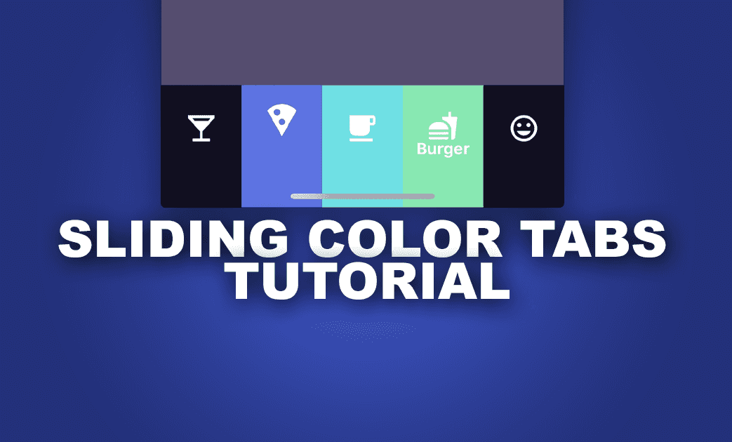
Sliding Colors Tab Bar Animation in NativeScript
In this tutorial, you'll learn how to create a bottom navigation bar with a sliding color animation. This tutorial will be focused more on…
Take control of your career. Build JavaScript mobile apps.
In this tutorial, you'll learn how to create a bottom navigation bar with a sliding color animation. This tutorial will be focused more on creating the custom tab bar rather than how to use the Tabs component.
Getting Started
Lets begin with a parent GridLayout with rows * and auto in our home.component.html to divide the screen into 2 parts - the main content area and the tab area.
Set up the main content using nativescript's Tabs component. In order to use a custom tab bar instead of the default one, we will need to omit the TabStrip tag. (more info on that on this blogpost by Martin Yankov).
We'll create 5 TabContentItem and their corresponding tab elements in our custom tab bar for this tutorial.
<!-- home.component.html -->
<GridLayout rows="*, auto">

  <!-- main content -->
  <GridLayout>
        <Tabs [selectedIndex]="selectedIndex" (selectedIndexChanged)="onSelectedIndexChanged($event)">
            <TabContentItem [backgroundColor]="tabList[0].backgroundColor">
                <StackLayout>
                    <Label text="Bottom Nav Content 1" class="h1 text-center p-t-20"></Label>
                </StackLayout>
            </TabContentItem>

            <TabContentItem [backgroundColor]="tabList[1].backgroundColor">
                <StackLayout>
                    <Label text="Bottom Nav Content 2" class="h1 text-center p-t-20"></Label>
                </StackLayout>
            </TabContentItem>

            <TabContentItem [backgroundColor]="tabList[2].backgroundColor">
                <StackLayout>
                    <Label text="Bottom Nav Content 3" class="h1 text-center p-t-20"></Label>
                </StackLayout>
            </TabContentItem>

            <TabContentItem [backgroundColor]="tabList[3].backgroundColor">
                <StackLayout>
                    <Label text="Bottom Nav Content 4" class="h1 text-center p-t-20"></Label>
                </StackLayout>
            </TabContentItem>

            <TabContentItem [backgroundColor]="tabList[4].backgroundColor">
                <StackLayout>
                    <Label text="Bottom Nav Content 5" class="h1 text-center p-t-20"></Label>
                </StackLayout>
            </TabContentItem>
        </Tabs>
    </GridLayout>

    <!-- bottom tabs -->

</GridLayout>
Configuration
Lets start by setting up an interface for our tabs configuration. Let's call it BottombarSlidingColorConfig for the tab bar and Tab for each individual tab item.
// bottombar-sliding-color.ts
export interface BottombarSlidingColorConfig {
    backgroundColor: string,
    height: number
}

export interface Tab {
    image: string,
    text?: string,
    backgroundColor: string
}

export interface Tabs extends Array<Tab> { }
To achieve the sliding effect, we will start with the template. The component is comprised of the following:
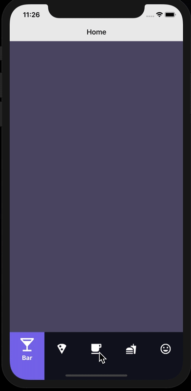
- base layer (containing the background color of each tab item),
- mask layer (the inactive tab background colors that will slide to expose the active tab)
- tab contents layer (contains image and text for each tab)
In terms of z-index, the tab image and text layer will be stacked on top of the mask layer which is then stacked above the base layer.
To make the tabs configurable from the parent component, we will use the tabs and config properties that was passed in to generate and style the tabs instead of hardcoding those in our template.
Container
Lets start off with a GridLayout to house all our layers, and set its height and backgroundColor using values from our config. We will also set the columns property to gridColumns, which we will go over in the next section.
<GridLayout *ngIf="tabs && gridColumns" [columns]="gridColumns"
    [height]="config?.height || 60"
    [backgroundColor]="config?.backgroundColor || '#0D0D12'"
    verticalAlignment="bottom">

</GridLayout>
Define gridColumns
Declare gridColumns with type string in our component file, and we will set its value in our OnChanges hook. The purpose of gridColumns is to divide the tab component into the number of tab items we need with equal widths. To do that, we will create an array with '*' and join them with a comma.
ngOnChanges(changes: SimpleChanges): void {
	if (changes.tabs && changes.tabs.currentValue) {
		let wildcard = [];
		changes.tabs.currentValue.forEach(item => {
			wildcard.push('*');
		});
		this.gridColumns = wildcard.join(',');
	}
}
Base Layer
For this layer, we will loop through the tabs array and create a GridLayout setting its backgroundColor to what we defined in the parent component. The actual tab contents (image and text) will be handled in the top most layer of our custom tab component.
<!-- Tab backgrounds -->
<GridLayout *ngFor="let tab of tabs; let i = index" [col]="i"
	[backgroundColor]="tab.backgroundColor">
</GridLayout>
Mask Layer
The mask layer will be wrapped in an AbsoluteLayout, which will contain a GridLayout for the
The mask itself is comprised of 2 parts, a left mask and a right mask. The reason for this is so we can animate the left and right mask independent of each other to create the chasing animation effect.
<!-- moving mask -->
<AbsoluteLayout col="0" [colSpan]="tabs.length">
	<GridLayout columns="auto, auto, auto">
		<GridLayout #leftMask col="0" [height]="config?.height || 60"
			[backgroundColor]="config?.backgroundColor"></GridLayout>
		<GridLayout #centerMask col="1" [height]="config?.height || 60">
		</GridLayout>
		<GridLayout #rightMask col="2" [height]="config?.height || 60"
			[backgroundColor]="config?.backgroundColor"></GridLayout>
	</GridLayout>
</AbsoluteLayout>
Tab Contents Layer
This layer will contain the tab's image and text and also be handling the tap events (since this is the topmost layer of our tab component. Similar to our base layer that contains the background colors for each tab, we will loop through each tab and set the image and text of each one, and also attach a tap event.
<!-- Tab image and text -->
<GridLayout *ngFor="let tab of tabs; let i = index" [col]="i"
	(tap)="selectTab(i)">
	<Image #tabImage [src]="tab.image" height="25" width="25"></Image>
	<Label #tabLabel [text]="tab.text || ''" fontSize="15" fontWeight="bold" color="#fff" marginBottom="10" 			verticalAlignment="bottom" horizontalAlignment="center"></Label>
</GridLayout>
Wrapping up the template
Combining all the individual layers we created, we should end up with a template like this
<!-- bottombar-sliding-color.component.html -->
<GridLayout *ngIf="tabs && gridColumns" [columns]="gridColumns"
    [height]="config?.height || 60"
    [backgroundColor]="config?.backgroundColor || '#0D0D12'"
    verticalAlignment="bottom">

    <!-- Tab backgrounds -->
    <GridLayout *ngFor="let tab of tabs; let i = index" [col]="i"
        [backgroundColor]="tab.backgroundColor">
    </GridLayout>

    <!-- moving mask -->
    <AbsoluteLayout col="0" [colSpan]="tabs.length">
        <GridLayout columns="auto, auto, auto">
            <GridLayout #leftMask col="0" [height]="config?.height || 60"
            [backgroundColor]="config?.backgroundColor"></GridLayout>
	    <GridLayout #centerMask col="1" [height]="config?.height || 60">
	    </GridLayout>
	    <GridLayout #rightMask col="2" [height]="config?.height || 60"
	      [backgroundColor]="config?.backgroundColor"></GridLayout>
        </GridLayout>
    </AbsoluteLayout>

    <!-- Tab image and text -->
    <GridLayout *ngFor="let tab of tabs; let i = index" [col]="i"
        (tap)="selectTab(i)">
        <Image #tabImage [src]="tab.image" height="25" width="25"></Image>
        <Label #tabLabel [text]="tab.text || ''" fontSize="15" fontWeight="bold" color="#fff" marginBottom="10" verticalAlignment="bottom" horizontalAlignment="center"></Label>
    </GridLayout>

</GridLayout>
Animating the UI elements
Moving on to more exciting part - creating the animations for our tab bar.
Getting references to the UI elements
To start off, we will need to get references to our UI elements to be able to animate them. We will be using @ViewChild and @ViewChildren to get referenes to our UI elements. We will first need to import the following properties from @angular/core
// bottombar-sliding-color.component.ts
import { ViewChild, ElementRef, ViewChildren, QueryList } from "@angular/core";
Followed by the following to get reference the our tab bar components.
// bottombar-sliding-color.component.ts

// to animate the highlight
@ViewChild('centerMask', { static: false }) centerMask: ElementRef;
@ViewChild('leftMask', { static: false }) leftMask: ElementRef;
@ViewChild('rightMask', { static: false }) rightMask: ElementRef;

// to animate image
@ViewChildren('tabImage') tabImage: QueryList<ElementRef>
@ViewChildren('tabLabel') tabLabel: QueryList<ElementRef>
Initializing the Tabs
We will intialize the tabs on the ngAfterViewInit hook (to make sure that we have access to all the elements on our template), setting up the tab elements' widths and x translation and the active/inactive tab stylings.
// bottombar-sliding-color.component.ts

ngAfterViewInit(): void {
    this.initializeTabs();
}

initializeTabs(): void {
	// set up widths
	this.centerMask.nativeElement.width = screen.mainScreen.widthDIPs / this.tabs.length;
	this.leftMask.nativeElement.width = screen.mainScreen.widthDIPs;
	this.rightMask.nativeElement.width = screen.mainScreen.widthDIPs;

	// set up x translations
	this.leftMask.nativeElement.translateX = this.getMaskTranslateX(this.selectedIndex - 1);
	this.rightMask.nativeElement.translateX = this.getMaskTranslateX(this.selectedIndex);

	// set the selectedTab
	this._selectedTab = this.selectedIndex;

	// set the active/inactive image styling
	this.tabImage.toArray().forEach((item, i) => {
	if (i === this.selectedIndex) {
		this.animateCurrentImage(item, false);
	} else {
		this.animatePreviousImage(item, false);
	}
	});

	// set the active/inactive text styliing
	this.tabLabel.toArray().forEach((item, i) => {
		if (i === this.selectedIndex) {
			this.animateCurrentText(item, false);
		} else {
			this.animatePreviousText(item, false);
		}
	});
}
Handling the tap events
Previously, we set up a tap event on our tab contents layer for each individual tab which calls selectTab passing the index of the tapped tab. This function will be handling the animations of the tab and also emitting the selectedIndexChange event. We added a shouldEmit variable to this function to give more flexibility if we don't want to emit an event (this might be useful if we want to select the tab programmatically and don't want to emit the event).
I split the animation into 3 parts here, one for animating the tab mask (animateTab), one for the inactive to active tab (animateCurrentTab), and one for the active to inactive tab (animatePreviousTab). We will go into more detail on each one in the next sections.
selectTab(index: number, shouldEmit: boolean = true): void {
	const previousTab = this._selectedTab;
	// only animate if user taps on a different tab
	if (index !== this._selectedTab) {
		this._selectedTab = index;
		this.animateTab(index, previousTab);
		this.animateToActiveTab(index);
		this.animateToInactiveTab(previousTab);
	}
	// always emit the new index, unless explicitly stated not to
	if (shouldEmit) {
		this.selectedIndexChange.emit(this._selectedTab);
	}
}
AnimateTab
This will be used to animate the mask to create the chase effect. As mentioned earlier, to do this, we will be animating the left and right independently.
Lets start with creating a helper function to calculates the translateX for each index
getMaskTranslateX(index: number): number {
	return (index * screen.mainScreen.widthDIPs / this.tabs.length) - screen.mainScreen.widthDIPs;
}
We will be using Animations and AnimationDefinition to run our animations, lets import them in our component file
import { Animation, AnimationDefinition } from "tns-core-modules/ui/animation";The animation will be divided into two parts, we will call it the stretch and the chase.
The Stretch
First, we want to move the left or right mask first depending on the direction. If we are going from left to right, we want the right mask to animate first, and vice versa. To do this, we will set a condition on the target in our animation definition to select one of the mask depending on if the current index is greater than the previous index. This will create a stretch effect, revealing the base layers between the previous tab and the current tab.
startStretchAnimation(index: number, previousIndex: number): Promise<void> {
	const definitions = new Array<AnimationDefinition>();
	const def: AnimationDefinition = {
		target: index > previousIndex ? this.rightMask.nativeElement : this.leftMask.nativeElement,
		translate: { x: this.getMaskTranslateX(index), y: 0 },
		duration: 150
	}
	definitions.push(def);
	let animationSet = new Animation(definitions);
	return animationSet.play()
}
The Chase
The stretch will be followed by the chase animation, moving the other mask to follow the animated mask. To do this we will set the target to the opposite of the previous target.
startChaseAnimation(index: number, previousIndex: number): Promise<void> {
	const definitions = new Array<AnimationDefinition>();
	const def: AnimationDefinition = {
		target: index > previousIndex ? this.leftMask.nativeElement : this.rightMask.nativeElement,
		translate: { x: this.getMaskTranslateX(index), y: 0 },
		duration: 200
	}
	definitions.push(def);
	const animationSet = new Animation(definitions);
	return animationSet.play();
}
Chaining the animations
Since both animations returns a promise, we can just chain them together using then
animateTab(index: number, previousIndex: number): Promise<void> {
	return this.startStretchAnimation(index, previousIndex).then(() => {
		return this.startChaseAnimation(index, previousIndex);
	});
}
Active/Inactive Tab Animation
In addition to the moving mask, we also have a active and inactive state for each tab with some transition animations. Both of these looks similar, but for the purposes of this tutorial, I will split it into 2 sections - AnimateToActiveTab and AnimateToInactiveTab.
Lets start with creating some helper functions to get the image and text elements at a particular index, which we will use to get the elements to be animated in both active and inactive animations.
getImage(index: number) {
	if (index < this.tabs.length) {
		return this.tabImage.toArray()[index];
	} else {
		return this.tabImage.toArray()[0];
	}
}

getText(index: number) {
	if (index < this.tabs.length) {
		return this.tabLabel.toArray()[index];
	} else {
		return this.tabLabel.toArray()[0];
	}
}
AnimateToActiveTab
To create the inactive to active tab animation we will create 2 separate functions
animateCurrentImage- to animate the image (image gets enlarged)animateCurrentText- to animate the text (text slides up)
Note that I added an optional animate parameter to both the functions, this is just to make these more easily configurable, if we want to show the active state without the animation (for example, on page load when the tab displays the default selected tab)
// enlarge current tab image
animateCurrentImage(arg: any, animate: boolean = true): Promise<any> {
	if (animate) {
		return arg.nativeElement.animate({
			scale: { x: 1.3, y: 1.3 },
			translate: { x: 0, y: - 10 },
			curve: AnimationCurve.cubicBezier(1, .02, .45, .93),
			duration: 200
		});
	} else {
		arg.nativeElement.scaleX = 1.3;
		arg.nativeElement.scaleY = 1.3;
		arg.nativeElement.translateX = 0;
		arg.nativeElement.translateY = - 10;
		return Promise.resolve();
	}
}

// animate in current tab text
animateCurrentText(arg: any, animate: boolean = true): Promise<any> {
	if (animate) {
		return arg.nativeElement.animate({
			translate: { x: 0, y: 0 },
			curve: AnimationCurve.cubicBezier(1, .02, .45, .93),
			duration: 200
		});
	} else {
		arg.nativeElement.translateX = 0;
		arg.nativeElement.translateY = 0;
		return Promise.resolve();
	}
}
Now that we have those setup, we will just have to chain them together using promises.
animateToActiveTab(index: number): Promise<void> {
	return this.animateCurrentImage(this.getImage(index)).then(() => {
		return this.animateCurrentText(this.getText(index))
	});
}
AnimateToInactiveTab
I won't go into much detail with this one since this is very similar to how we did the inactive to active tab, except the animations are reversed. So heres the code:
// shrink previous tab image back to original size
animatePreviousImage(arg: any, animate: boolean = true): Promise<any> {
	if (animate) {
		return arg.nativeElement.animate({
			scale: { x: 1, y: 1 },
			translate: { x: 0, y: 0 },
			curve: AnimationCurve.cubicBezier(1, .02, .45, .93),
			duration: 200
		});
	} else {
		arg.nativeElement.scaleX = 1;
		arg.nativeElement.scaleY = 1;
		arg.nativeElement.translateX = 0;
		arg.nativeElement.translateY = 0;
		return Promise.resolve();
	}
}

// animate out previous tab text
animatePreviousText(arg: any, animate: boolean = true): Promise<any> {
	if (animate) {
		return arg.nativeElement.animate({
			translate: { x: 0, y: 80 },
			curve: AnimationCurve.cubicBezier(1, .02, .45, .93),
			duration: 200
		});
	} else {
		arg.nativeElement.translateX = 0;
		arg.nativeElement.translateY = 80;
		return Promise.resolve();
	}
}

animateToInactiveTab(index: number): Promise<void> {
	return this.animatePreviousImage(this.getImage(index)).then(() => {
		return this.animatePreviousText(this.getText(index))
	});
}
Something to note here is the animateToInactiveTab looks identical to the animateToActiveTab in the previous section, passing the index to our helper functions. The index being passed into the animateToInactiveTab is the index of the previous active tab whereas the index being passed into the animateToActiveTab is the index of the active tab.
Using our Custom Tab Component
To give us more control and flexibility with the tab contents and properties, we set up our custom tab component to accept a few configurations as inputs from the parent. Let start by defining those and passing it to our tab component.
Import Tabs interface to define the properties of the each tab and pass it to the bottombar component as tabs and BottombarSlidingColorConfig interface to define the styling of the bottombar and pass it in as config.
// home.component.ts

import { Tabs, BottombarSlidingColorConfig } from "./bottombar-sliding-color/bottombar-sliding-color-config";

// set up each tab item
tabs: Tabs = [
  { image: 'path/to/image', text: 'Home', backgroundColor: "#7B6BE7" },
  { image: 'path/to/image', text: 'Notifications', backgroundColor: "#5A73DD" },
  { image: 'path/to/image', text: 'Profile', backgroundColor: "#6CDFDF" },
  ...
];

// set up tab configuration
bottombarConfig: BottombarSlidingColorConfig = {
  height: 80,
  backgroundColor: '#10101F'
};
<!-- home.component.html -->
<GridLayout rows="*, auto">
<!-- main content -->
...
<!-- bottom tabs -->
<app-bottombar-sliding-color [tabs]=" tabs" [selectedIndex]="0"
[config]="bottombarConfig"
(selectedIndexChange)="onTabIndexChange($event)">
</app-bottombar-sliding-color>
</GridLayout>To update our Tabs component (which we created at the beggining of the post) with the new tab index, we just have to update the variable which was binded to the Tab's selectedIndex property whenever our custom tab bar emits the new selected index.
onTabIndexChange(index: number): void {
	// this is the property binded to the Tabs component
	this.selectedIndex = index;
}
Wrapping up
Thats it, we just created a custom tab bar that can be used with nativescript's Tab components. Checkout the full source code here and a playground version here